
Pareto Chart in Lean Six Sigma: Focus on the Vital Few
What Is a Pareto Chart?
A Pareto Chart is a visual tool used to identify the few causes responsible for the majority of problems, defects, delays, or outcomes within a process. It combines a bar chart with a cumulative percentage line to help teams prioritize improvement efforts where they will have the greatest impact.
The concept is based on the Pareto Principle, often referred to as the “80/20 Rule,” which suggests that roughly 80% of effects often come from 20% of causes.
In Lean Six Sigma, Pareto Charts help teams avoid spreading resources too thin by focusing attention on the “vital few” rather than the “trivial many.”
Why Pareto Charts Matter
Organizations often face dozens of issues at once:
-
customer complaints,
-
defects,
-
delays,
-
downtime,
-
missed deadlines, or
-
or operational inefficiencies.
Pareto Charts help organizations:
-
identify high-impact problems quickly,
-
prioritize improvement opportunities,
-
focus resources effectively,
-
support data-driven decision-making, and
-
maximize improvement efforts.
Without prioritization, teams can become overwhelmed and spend time solving problems that have little overall impact. Rather than treating all problems as equally important, Pareto Analysis helps teams concentrate on the issues contributing most significantly to poor performance.
When to Use a Pareto Chart
A Pareto Chart should be used when teams need to identify which problems, causes, or categories are contributing most significantly to an overall issue. It is especially useful when:
-
multiple problems exist at the same time,
-
resources or time are limited,
-
teams need to prioritize improvement efforts,
-
data has been collected and categorized, or
-
decision-making needs to be based on measurable evidence rather than assumptions.
Pareto Charts are commonly used to analyze:
-
customer complaints,
-
defect types,
-
downtime causes,
-
safety incidents,
-
service delays,
-
error categories,
-
warranty claims, and
-
operational inefficiencies.
By visually separating the “vital few” from the “trivial many,” Pareto Analysis helps organizations focus improvement efforts where they are most likely to produce meaningful results.
In Lean Six Sigma, Pareto Charts are often used early in improvement projects to narrow the focus before conducting deeper root cause analysis.
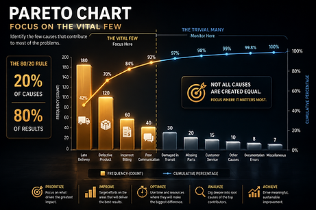
How a Pareto Chart Works
A Pareto Chart organizes categories of problems or causes from highest frequency to lowest frequency. The chart contains two key elements:
Bar Graph
The bars represent the frequency or impact of each category, such as:
-
defects,
-
complaint types,
-
downtime causes, or
-
error categories.
The bars are displayed in descending order from largest to smallest.
Cumulative Percentage Line
The line graph shows the cumulative contribution of each category toward the total problem. This helps teams visually identify where the “80%” threshold occurs and determine which causes should be prioritized first.
Key Concepts in Pareto Analysis
Here are some of the distinguishing features of a Pareto analysis:
-
Frequency: How often a problem or issue occurs.
-
Impact: The severity, cost, or consequence associated with a problem.
-
Cumulative Percentage: The running total percentage displayed by the cumulative line.
-
Vital Few: The small number of causes responsible for most of the impact.
-
Trivial Many: The larger number of smaller causes contributing relatively little overall impact.
-
Prioritization: Focusing time, energy, and resources where they will generate the greatest improvement.
Common Pitfalls to Avoid
Pareto analysis and the Pareto chart are extremely useful tools—but only when done correctly. Avoid these common mistakes:
-
Assuming the 80/20 Split Is Exact: The Pareto Principle is a guideline, not a strict mathematical rule.
-
Using Poor or Incomplete Data: Inaccurate data can lead to incorrect prioritization.
-
Ignoring Smaller but Critical Issues: Some low-frequency issues may still carry significant risk or consequence.
-
Focusing Only on Symptoms: Pareto Charts identify priorities, but additional root cause analysis tools may still be required.
Where Pareto Charts Fit in Lean Six Sigma
Pareto Charts are commonly used during the:
of DMAIC projects.
They are especially useful for:
-
arrowing project focus,
-
identifying high-priority issues, and
-
guiding deeper root cause investigations.
Pareto Analysis is often used alongside:
-
Fishbone Diagrams,
-
Five Whys,
-
Check Sheets,
-
Histograms, and
-
Control Charts.
Related Tools and Methods
A Five Whys analysis quickly identify the root cause of a problem rather than just addressing surface-level symptoms. Common tools include:
-
Brainstorming and Team Voting
-
Check Sheets
-
Histograms
-
Scatter Diagrams
-
A3 Problem Solving
Different tools serve different purposes, but they all support the same goal: Find the real cause. Fix the real problem.
Ready to Go Beyond the Basics?
If you're ready to move from understanding concepts to applying them:
👉 Explore our full Lean Six Sigma learning paths
👉 Start building real-world improvement skills today
👉 Access over 1,000 courses with an RPM Platinum membership